Mixed-media paper crafter; stamper, freelance craft tutor, designer of PaperArtsy JOFY stamps

29 September 2017

#365Challenge.... April !!

Oh my word! ... this was five months ago!  ... and I left you at 7th April!

I should probably remind you what the #365Challenge is:  I'm answering all the questions asked on the Flow Magazine question-a-day calendar. If I like the question (am able to answer the question) I create a page with the answer.. and if I don't like the question I simply make a nice page instead. lol  Sounds simple, yes?  Well sometimes yes and sometimes no!

my project = my rules!

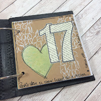
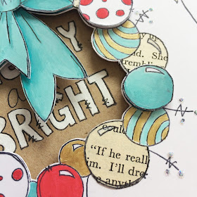
Here are the completed pages for April... using the big number stamps was a challenge - but that's what this project was partly about - to challenge myself and {hopefully} learn something along the way....  

Used a gelli print as the coloured panel on this page, over-stamped with a mini stamp - JM49, the sentiment is from the PaperArtsy ZinskiArt stamp set ZA08 (great little sentiments!)


I like how the numbers on this page seems to be in the grasses.

I wanted to look through the numbers on this page so created an acetate overlay - stamping the numbers onto the overlay with Snowflake Fresco Finish paint and filling in the numbers with Pearl Glaze.
 I really like the Chalkboard look of this page - the Fresco Finish paints are great for achieving this effect (flowers are stencil PS055)

oooh Distress Oxide ink background!! what's not to love!?!


I ended April here... maybe I'll go back and finish it later in the year but for now its 'finished' ... on to the next month..


Share:

28 September 2017

Can you ever have too many journals??...

... I think not if you've been lucky enough to get your hands on the latest Eileen Hull / Sizzix Travel Journal die (ref: #661906).. its such a great die for making a journal - you can see my first one here:

I mentioned in that blog post that when cutting the inside pages I ended up with leftovers - enough to create a couple of books.... I had to do something with those didn't I?! or they would just clutter up the desk.. so I made a 1/2 size journal with them using the same die..


Here's a simple step-by-step of how I made this fabric covered journal...


I die cut one cover out GrungePaper - a good substrate to use because its both strong and flexible (lightweight too), and really easy to die cut! I measured 1/2 way along the length ....


 .... and cut it in half with scissors (you could use a craft knife if you prefer).


This creates two covers half the size of the originals. The binding holes are still visible so I laid the two covers on top of each other so the spines were together...


... and used the holes in one cover to mark where the holes should be in the other cover - this gives the right amount of binding holes in each cover.


I punched the marked holes with a Crop-a-Dile, and also measured and punched the centre binding hole (which was lost when I cut the cover in half at the beginning).


I rounded the corners with the CornerChomper making all corners the same.


Here are the cut covers waiting to be sewn - I ran across the spine a couple of times at the top and bottom, and down the spine (where the covers overlap) between the holes (sewing not shown).


I placed the covers onto my chosen fabric, cutting it flush to the edge.  I also cut and attached a panel of 'bondaweb' to hold the fabric in place {NB if you choose to do this - beware of the heat on Grungepaper!!}.

I sewed the fabric onto the Grungepaper by sewing zig-zag stiches all the way around the edge, and straight stitching randomly across the covers.


The binding holes were set with eyelets and threaded with elastic. On my first journal I tied the elastic with a double (maybe triple) knot because I worried that the knot would be pulled to the inside of the spine if the book became chunky and stretched the elastic ... So I've used a solution Kate Crane used on her version of this journal - which was to secure the binding with a big button - what's not to love about a big button!!


I really enjoyed making this journal - LOVE the fabric: its so 'happy' so this might be my 'happiness' journal - a place to jot down those little things in life that make me smile.

We'll see ....

x

Share:

Excited to be on the SimonSaysStamp.com blog today....

... as part of their STAMPtember event.  This has been an inspiring month long event.  Today they're spotlighting PaperArtsy and it was my pleasure to create a couple of cards to help showcase the company I'm proud to be part of..... 

Click on the photo below to see the post in full and take advantage of the accompanying discount code.

http://www.simonsaysstampblog.com/blog/stamptember-spotlight-feature-paper-artsy/

Enjoy!

x
Share:

22 September 2017

ALBOTAT: Sometimes you just 'need' to make something...

.... and today was one of those days... the lovely postman delivered my Eileen Hull Sizzix Travel Journal die and my (small) to-do list was sidelined for a while as I set about making a 'simple' version of the journal - I call it simple because I made it out of basics to create a 'working' version - something that I could refer to when I make more later on.. and I will be making more later... I can feel a version with corrugated cardboard covers coming on... lol


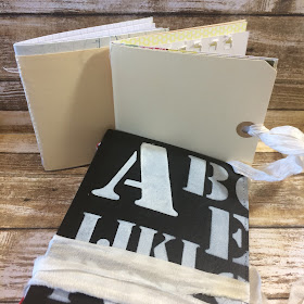
I made this journal out of kraft card and I cut and glued & sewed two layers together to give the covers more strength (and sewed the centre join).  I painted it black (to keep it clean - its a travel journal, & will be in my handbag so may get grubby), stenciled on the letters (a That's Crafty stencil) and sewed on ties - I really like using ribbons to wrap around and keep the journal closed.
There weren't any directions about how big/thick the books should be that fit inside so I made mine 10x21cm (20x21cm folding at 10cm) which made them nice and easy to cut out.  I cut 3 books of 6 pages each - different types of paper giving it a junk journal feel.


Because I cut the pages from larger sheets of paper I ended up with lots of smaller pieces which I used to make little journals...

Can't have too many books ready to be painted & doodled into, can you?

Looking forward to seeing what everyone else is creating with their dies.

x
Share:

21 September 2017

Christmas is coming.....

.... to Birds in the Barn this coming Saturday (23.09.17) where I'll be teaching two card making classes.. There are a couple of places left so if you fancy getting a little bit festive then call the shop to book your place... 01206 211099


Look forward to seeing you there.

Ho ho ho!

x
Share:

14 September 2017

101 days until....

...CHRISTMAS!!!!!

No no no don't run away!  I thought I'd just give you fair warning, as these things do seem to come around quicker these days don't you think!! (especially as it doesn't feel like we've had a proper summer yet this year here in the UK!)

aaaaanyhoo - the main reason for this festive blog post is to let you know I have....
new Christmas stamps 
....released today, and available at your local PaperArtsy stockist...

This year's stamps feature borders, chunky sentiments, lots of stars and trees, and a gorgeous wreath!  And a snowman - there's always a snowman!!


(and anyone caught calling my snowman 'fat' is going straight to the top of Santa's Naughty List! lol)


On the blog I suggested how you could amend the ornament cluster on JOFY56 to add someone's name - I thought I'd quickly show you here how to do that:

Trim a piece of washi tape (or masking tape) to cover the word 'Noel', ink up the stamp & REMOVE THE WASHI TAPE...

Stamp the image and the label is now empty & ready for you to add the recipients name!  Simple!

Here's a tag (coloured with Distress Oxides) using the elements created above.


I have lots of samples over on the PaperArtsy blog tonight to hopefully inspire you, and tomorrow and Thursday I have two creative wingmen showing you their (gorgeous) samples made with the stamps. Pop on over each evening - you won't be disappointed!

Is it too soon to wish you Merry Christmas?!! :o)

x
Share:

3 September 2017

Wanderlust 2017

Early in August my class for Wanderlust went live and I can now show you the project - here it is (don't adjust your sets - there isn't any music/voice over):


Wanderlust 2018 has just been released so if you want to take a fantastic year long art class click on the link below for more information:

Share:

1 September 2017

BOO!

... yes BOO!  just grabbing your attention as its been a while since I blogged - once a month for the past few months really is not good enough is it!. Life, work and 'stuff' got in the way.. but I'm back with a new determination to do better! (well lets be honest - I can't do much worse can I!)

aaaanyhoo

let get things started...

At the beginning of August I demo'd at Birds in the Barn near Colchester in Essex (lovely shop in the grounds of an equally nice garden centre - worth a trip) and in the morning I was using the fabulous Distress Oxide inks.... if you don't have any of these yet you need to get yourself down to your nearest craft shop and get some - you won't regret it...

Here are some of the samples.... look at the prettiness - the opaqueness of these inks...  and that's the main difference I think between the Oxides and original Distress Inks....

and because they're opaque you can build up layers of colour - the samples below illustrate that... add a colour, dry, add another colour:

Water will affect the Oxide inks in the same way as the originals.  The sample top right in the photo below shows a blended background where I spritzed a stamp with water and pressed it onto the surface - this removes the ink (left hand panel) and on the panel on the right I over stamped using the Distress Oxide (oh yes, you can stamp with them as normal)
The sample on the bottom left of the above photo is where I've added Broken China ink to a kraft panel (using a blending tool), dried that layer and then overstamped with the image using the same colour ink.

The kraft panel sample below was created by pressing ink onto craft sheet, spritzing with water and then laying the kraft panel onto the ink - this was Peeled Paint ink - look how the Oxide has drawn out the blue that goes into making up the green colour - love how different colours are drawn out.
The other sample above was created with lots of layers of Distress Oxide, water splashes and stamping with the Oxides. I stamped on numbers (using black Archival) and they seem to 'hover' on the surface don't they?! as if there is a layer of acetate between the oxides and the archival... interesting.  I painted the right had set of numbers with water to lift some off the colour.

When I get inks or paints I like to create a sample swatch of each for reference and with the Oxides I splashed each one with water to see how water affected the Oxide side of the inks....  The most interesting of these was Frayed Burlap - it was a surprising result when splashed with water and dried - so much so that I repeated it with a second tag. The first tag is on top on right, second tag on left underneath.  Look how different the effect is!  I think this is one of the interesting things about the inks. (note: the ink was applied by rubbing the ink pad over the tag so the ink is quite saturated/intense).

Here's a card I made using one colour of ink - Walnut Stain, bit of a favourite of mine.  Blended the background, splashed with water. Dried the ink. Stamped with same colour (seedhead from JOFY38, another favourite). Dried. Then spritzed the stamp with Perfect Pearl Mists in Heirloom Gold - this removed the ink and left a lovely sparkly image that catches the light (photo on right)... a little bit lush isn't it!

But it isn't only backgrounds and stamping you can do with the inks - I am loving how you can water colour paint with them as I've done on the sample below... (image is from JOFY53)

I hope these simple samples inspire you to try the inks - they really are worth it (but please don't blame me when you realise you NEED the entire set).

x

Share:
Blogger Template Created by pipdig