Mixed-media paper crafter; stamper, freelance craft tutor, designer of PaperArtsy JOFY stamps

20 February 2016

ACP2: RED + D

This post on the ACP2 project is brought to you by the colour RED and the letter D... as with C there is lots of craftiness beginning with D.. and I had different plans for a 'D' project until I was hit with a cold/cough/sinus bug that floored me for about a week... sniff sniff cough sneeze lol  but I rallied (thanks to Sudafed, Strepsils, Karvol and Meltus lol)(other medicines are, of course, available lol).. and my project took a different route.


I've chosen to mix all shades of red from 'blood' red through to orange...  and my chosen topics were distress and doodling....


I like doodling... but its 'controlled' doodling - it has to have some sort of plan, structure.. purpose..
So I've been doodling in my small sketchbook/journal - it measures 6x4 inches - great for mopping up paint, gelli prints or just mini journaling or sketches..

Recently I've been starting my doodles by stamping images on the pages and working around them - the ones below started by stamping a Hero Arts flower (which I LOVE - I used it on a masterboard project for Craft Stamper - you can see snapshot HERE) (shocked to see that this was SIX years ago!!) aaaaanyhoo I digress.. here are the two spreads I made with that stamp..

There is something striking about the black and white isn't there.. I like leaving the white space in the centre - gives breathing space...  I wanted to give each flower a different pattern...

So that was all very nice and relaxing.. but its not RED is it!.. but I was in a doodling mind set so I bought a pack (from Amazon) of white (and black) blank zentangle squares (shown by Chris Cresswell in a photo on a Facebook page).  The 'tiles' are 9.5x9.5cm so not too big, not too small - ideal for what I had in mind.

So that's the 'doodling', the 'distress' part of my project comes in the form of Distress Inks.  I haven't played with these for a while and I'd forgotten how easy they are to work with.  I pulled out all the red and got busy ( Barn Door, Ripe Persimmon, Festive Berries and Dried Marigold)

I taped four of the tiles together to make a...... yep, a masterboard lol well I couldn't wait until 'M' to create one of these - M's not due as part of this project until  JULY!

The distress inks used were. I created the spots using the tried&tested old favourite technique of water flicking/splashing. :o)

Next came the doodling - I methodically doodled each type of image - worked each of the leaves, then small circles, etc - I like to be organised and methodical about the (apparently) free doodling. :o)
and eventually it looked like this...


It was ready to broken apart and used - I created two cards (I like to mount these panels on different coloured backgrounds because they can look so different depending on the mount..) I also added more doodling - this time in white pen... These panels remind me of batik printed fabrics...
The sketchbook I used earlier for the black&white doodles is shown above - now with a nice masterboard panel on the front cover.

I hope this has inspired you to doodle around stamped images - give them your own spin - or dig out some inks or paints you haven't used in a while (as I did here with the Distress Inks) - or just to doodle!

I'll see you back here on the 1st of March (if not before) for a new colour and 2 more letters of the alphabet - E & F - if you have any suggestions for crafting themes for those letters add them in the comments section on this post and I'll add it to my lists.

As part of my 'research' for the Alphabet Colour Project I created boards on Pinterest for each colour - you can see my RED inspiration board HERE

Thanks for stopping by.

J

Share:

10 February 2016

ACP:2 Red + C

This is the first 'proper' post for the Alphabet Colour Project:2 .. I'm really enjoying putting together all the bits and pieces for the project... so much so that I have refiled all my decorative 12x12 papers in readiness! (the administrator in me raises its head again!!)

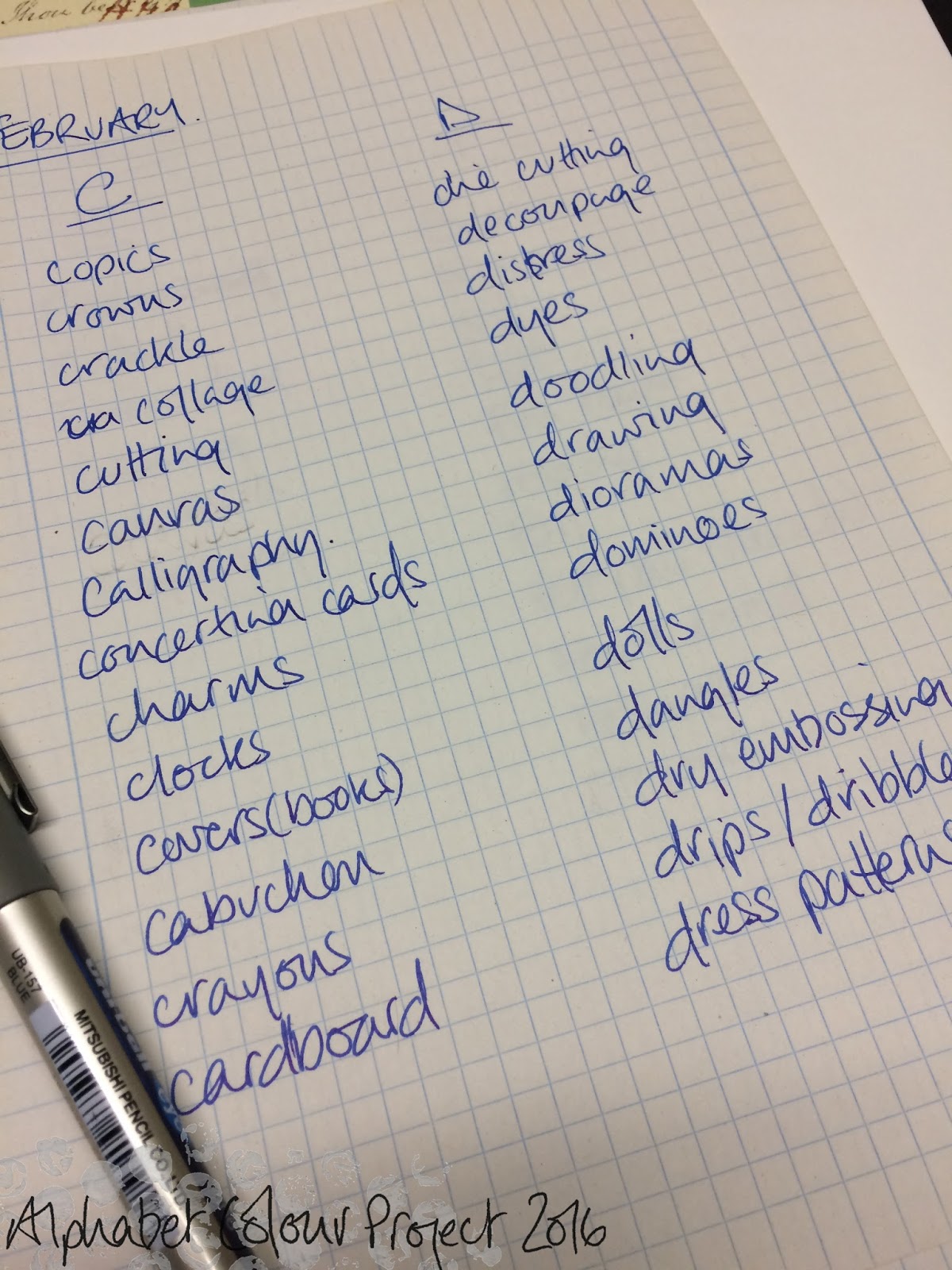
This post/project is brought to you by the colour RED and the letter C... lots of craft options beginning with the letter C (the further down the alphabet, the less options there seem to be - could you all please start thinking about options for x, y, & z! lol)(and yes, I have zentangle and zippers...)

Here are the colours I chose to work with red for this project... a kraft Cardboard base to create Cards.. simple..  I love seeing red with paler, tealy/turquoisey blues...


Cards with red as the focal colour, both basically created in the same way but different finishing touches and decoration...
I recently bought a couple of phrase/word block dies from 'Lil'inker designs' in America (www.lilinkerdesigns.com), and what with it being Valentines Day in a few days used the 'love you so much' die for these cards.
I die cut the word block from a panel of black card and trimmed it leaving just a narrow frame.

I die cut several hearts, cut parts from around their edges to make them slightly more asymmetric, then I doodled around the hearts to tie them in with the stamping on the red panel (image is from JOFY24)


The flowers on the card below are from JOFY12.


So that's project one of the ACP:2 project done and dusted.... just another 20ish to go... :o)

xx

Share:

9 February 2016

Fun Friday...

... spent with a lively & lovely group of ladies from the U3A.  My Mum belongs to the local group & they have several craft groups that meet regularly to create all kinds of cards with all sorts of techniques, and I went along last Friday to talk/teach all things stamping to two groups... It was lovely to help them with their stamping, and hopefully inspire them to use stamping more on their cards and other crafts.


Here are a few notes for those ladies:

This is the 'stamp press' - I was demonstrating with the larger size... Its made by Fiskars and is available online.

'Forget me not Kraft Kabin' is the shop local to us that stocks JOFY stamps, they are based in Rochford  - you can find them at 16 Golden Cross Parade, Rochford, SS4 1UV. tel: 01702 547833

JOFY stamps are also readily available online - another local stockist (online only) is www.imaginethatpapercrafts.co.uk


Thanks to all the ladies who came to the classes - happy stamping!
Share:

4 February 2016

All aboard... up Periscope!!

Well this was an exciting day lol... I popped into PaperArtsy - and was sucked into the Vortex that is PaperArsty HQ and didn't escape back out until I'd filmed a Periscope!!!  Baptism of fire!


It was a lot of fun!... brace yourselves - there could be a load more of these heading your way...lol but, one step at a time, here is today's 'scope and photos of the finished projects...


A big shout out (which I meant to do when we were filming) to Courtney who gave me a lovely manicure before I started filming .... ah the magic of television.

So here's a photo of the stamps and projects in progress.. I used one of Kay Carley's new stamp sets - EKC02 - GORGEOUS flower on that set, and JOFY32 for the large cherry blossom flower.


Here are all the different elements laid side by side - fabulous colours - during the demo'. :o)
((And in response to a comment on the 'scope I like to think I 'sweep' the colour from side to side...))


Sorry I couldn't comment, or say hello to you all as you popped up on screen but am very grateful you tuned in.
It was a lot of fun to film, I hope you enjoyed it.

x
Share:

3 February 2016

ALBOTAT: Stamps of a different kind..Part 2

Hi

Yesterday in my blog post I wrote about stamps and how interesting they can, and can be used in artwork - on cards, in journal - however you want really... Well, last week when I was tidying my workroom - oh yes! The 'big clear up/clear out'!!  - I became distracted (as usual!) by the bits and pieces laying on the desk... so I made this simple less-is-more page in a 6x6in journal.... I really like the white space on the page... 


The gold circles are a PaperArtsy Ellen Vargo image stamped and embossed in WOW 'Metallic Brass Sparkle' - a lovely colour which I use when I need gold... stamping the distressed circles over all the images ties it all together, and then the 'obersvation lessons' banner gives it a sort of subject/theme/focus. 
So there you have it - a clean and simple way of using stamps...

xx
Share:

2 February 2016

ALBOTAT / ACP:2 Stamps of a different kind....

... little mini works of art..

I raided the vintage stamp albums that I have gathered/been given and searched for bits and pieces for moodboards...


What I learned from the search is that stamps ...

*  have lots of lovely shades of colour

*  are mini works of art

*  are not many stamps issued in yellow... from any country!

Anyone else think that this stamp album would be better repurposed into journal pages...


I think this was my favourite from the search - love the aqua/teal/turquoise against the dark backround.

xx
Share:

1 February 2016

Alphabet Colour Project Mark.2

Waaaaay back in 2012 I had a plan for a project for my blog: 


For each calendar month I would choose a colour, and for each week of the year I would pick a letter & work my way through the alphabet picking a craft related theme for each letter.. ie:

I chose Grey for January, Week 1's letter was A for Aperture; week 2's letter was B for bunting (now there's a surprise!) so you get the drift how this was going to work.... or not..
(did I mention there were also colour mixes in there too for each project/week - grey+green, grey+blue... nightmare of my own making lol))


It lasted 8 weeks (hangs head in shame)... to the end of February and then it ground to a halt - there must've been a reason but I've no recollection of what it was.

but I really like the concept of the project so I'm resurrecting it.. a modified/ simpler version (obviously!)... 
AlphabetColourProject:2
This time around I'll still have one colour per month, but now just 2 letters... all spread out through the month..... the format is:
on the 01st -  a moodboard illustrating colour choice, the letters, and theme options
on the 10th - 1st letter and corresponding project
on the 20th - 2nd letter and corresponding project

I'm not starting right at the beginning again - starting at the logical place for February soooo:
.. RED ..


Red is my colour for the month and the letters C & D.... I've been making a list of any craft/art themes, techniques, equipment starting with all the letters of the alphabet - if anyone has any suggestions each month please pop them in the comments section of this post... suggestions gratefully received.. :o)

If you'd like to see any of the project from the Alphabet Colour Project Mark 1 then click 'ACP' in the labels listing on the left of the blog.

Best foot forward and all that....

xx
Share:

31 January 2016

Well its a New Year....

... so that means NEW STAMPS!!  For the next 7 days over on the PaperArtsy blog there will be new releases - how awesome is that!!.. so many fabulous new products it will make your head spin!... and I'm up first.


I'm really excited to share these stamps with you - its my most varied release to date and I think (I hope) there is something for everyone.

Visit the PaperArtsy Blog HERE where you can see lots of lovely samples made with my new stamps by my group of talented wingmen.


I designed 2 little ladies - the one on JOFY41 has her eyes closed and I imagine has her face to the sun, while her friend on JOFY42 in her boots looks ready for anything!
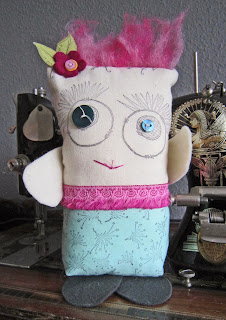
See that little happy little character on the JOFY42? that's a Critter. Some of you may recognise the name from a page on my blog - funny/cute little fabric creations I made that were 'not quite right' - well I'd wanted to create a stamp of one...  PaperArtsy have a Critter - you may have seen him on the PA stand at shows - he's called PAMM (PaperArtsyMiniMascot), recently I made him a girlfriend... and a stamp was a natural progression!
Now everyone can have a critter.
 

Its a jolly little critter.. I could resist replacing its button eyes with googly eyes:


Here is a great video that PaperArtsy made detailing all the stamps:


On the blog is a card featuring one of my robots - LOVE these little 'bots!! Details of how I created the card can be found there...


The large nuts on the card are die cuts.. but I don't have a die for nuts and so I improvised:


I die cut a hexagon out of silver card, then cut a smaller circle inside the hexagon - a nut!  Bazinga!


So, a new year and new stamps I was inspired to create a book. I've been thinking about positive phrases to focus my thinking, aims and approach to life (the universe and everything! lol).. so I put some of these phrases into this 'little book of Mantras' using Fresco Finish paints and a little (9x9cm) upcycled book that I rediscovered (unearthed) while clearing out my workroom (I had a serious  (ruthless - with myself and 'stuff') clearout - it felt soooo good!)
I wanted this to be a simple book.. playing with new stamps (JOFY41 &JOFY42), creating an inspirational set of pages - really a 'just for me' sort of project.
I'll leave you to 'play spot the new stamps' :o)


I bought several books in a charity shop..
Dinky little board books... removed the printed layer of each spread - peel them off (very theraputic! lol)... and paint!


I covered each spread in a different type of printeed book pages, and allowed them to dry.


Here are the covers.  I painted them in Teresa Green and Dusty Teal Fresco Finish paint.., a book page circle, strip of washi tape and the year die cut from kraft card... and a 'go to' stamp image.

The first spread features is my word for the year... 


... using letters that I found during the 'great clear up'!..


I'm always a little nervous about writing on pages - its the little voices in my head saying 'what if its not perfect'.. 'what if its not straight' ... then I have a stern word with myself (does it matter if its not perfect?!!), take a deep breath & draw lines in pencil, write the words in pencil and then write over them in pen... I made a feature of the lines to link the words across to the photo (taken from an old nature encyclopedia I bought in a charity shop).. stamped a loopy border a few times and 'shaded' using a charcoal pencil (gotta love those!)


I like this phrase.. when I'm having a testing day I often say this to myself.. Slate and Chalk created the background, prints of small bubble wrap and stamps of flowers.. words were stamped onto book text that had been painted with diluted Dusty Teal.

This alphabet, from JOFY21, is great to use - nice and blocky, easy to read - and more importantly - easy to cut out!


This phrase resonates with me too - for those days when MS Fatigue makes a visit... Created with washes of Dusty Teal and Slate and stamped images with book text.


So thats my little book - featuring several new stamps and favourite paint colours... I hope its inspired you to take a second look at board books, and to use my new stamps.. available now from your local PaperArtsy stockist.

Keep an eye on the PaperArtsy blog all this week where there will be more exciting things happening..

Share:

29 January 2016

New Year...

New Year... New top banner!

and then................. nothing... no new blog posts... no new class listings... no projects... I don't know why I'm telling you this - its really stating the obvious isn't! You all know there hasn't been anything... well, those of you who have popped by every now-&-then 'just in case' something has changed... so apologies to those who did that... (and thank you, of course, for stopping by)

but, I can assure you that while I haven't been here I haven't just been sitting on my behind somewhere else watching daytime TV twiddling my thumbs... oh no no no..

soon all the 'nothing' is going to change... soon there will be something....


.... quite a lot of somethings.. if all goes to plan..
Share:

23 December 2015

Final class of the year.... Part 2

.... a fun class creating this:

A 6x4 box canvas - people could make this with an initial of their choice - would make a cute gift..

and here are a few of the lovely colour variations created by the ladies in the class:

I'd demo'd painting the box in green and was really pleased when Denise (Denise, I think this is your  - apologies if its not) made hers using the same colour and pink flowers - one of my favourite colour combinations - so pretty!

I LOVE this yellow version - so bright and fresh and sunny! I think I may have mentioned on here how I am not a fan of yellow - but this project of Sue's may have converted me! Gorgeous. (Sue was wearing a cobalt blue top on the day so it looked even more striking against that!).

This blue and yellow version (Sue's) - again its swaying me towards yellow - love it - so fresh!

They all created beautiful projects.... I might have to rethink yellow!

x
Share:
Blogger Template Created by pipdig